

Prefer to listen?
Tap here to play it in the Substack app
Colour is usually the first thing a painting gives you. Before subject, before detail, before you’ve decided whether you even like it, the colour has already started interacting with the room. It can change the pace of a space in a way that’s hard to describe until you’ve lived with it for a while, and if you’ve ever wondered how colour affects mood in a room, art is one of the most direct ways to notice it.
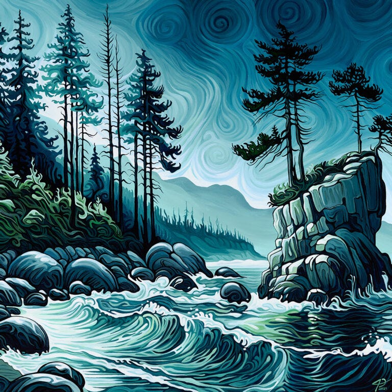
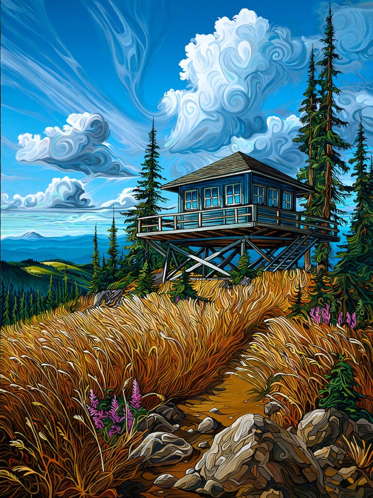
Blue
Blue tends to slow things down. Not in a dramatic way, and not as a rule, but as a quiet shift in the background. A blue-forward painting often feels cooler in the space, even when the temperature hasn’t changed. It can make a room feel more spacious, more settled, and it can pull sharp edges out of the air, especially under softer evening light. In bright daylight, blue can look clean and crisp. In warmer lamplight, it can deepen and feel more layered. It’s a colour that rewards time, because it changes gently rather than suddenly.

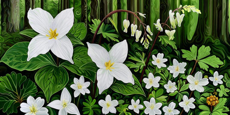
Green
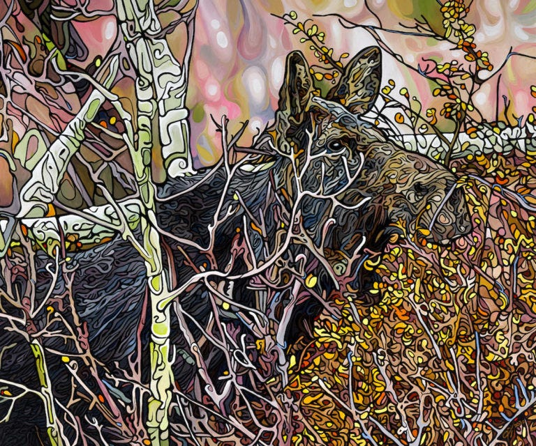
Green rarely feels neutral, even when it’s calm. It has a way of suggesting growth, distance, and outdoors without needing to depict anything literal. In a home, green often sits comfortably with wood, plants, stone, and natural textures, which is part of why it integrates so easily. It can steady a space that feels too bright or too busy, and it can also sharpen attention in a subtle way, like a reset for the eye. Green is often at its best when it isn’t trying to dominate, when it’s allowed to hold the room quietly and let other colours play around it.

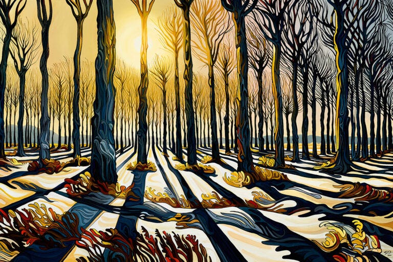
Yellow
Yellow can lift a room quickly, sometimes faster than people expect. In smaller amounts it reads like light, like warmth, like a kind of openness. It can make darker corners feel less heavy and bring clarity to surrounding colours. But yellow is also sensitive. Too much of it in a confined space can start to feel restless, as if the colour has nowhere to land. The difference is often not the yellow itself, but the context around it, the wall colour, the furnishings, the time of day, the kind of light hitting the surface.
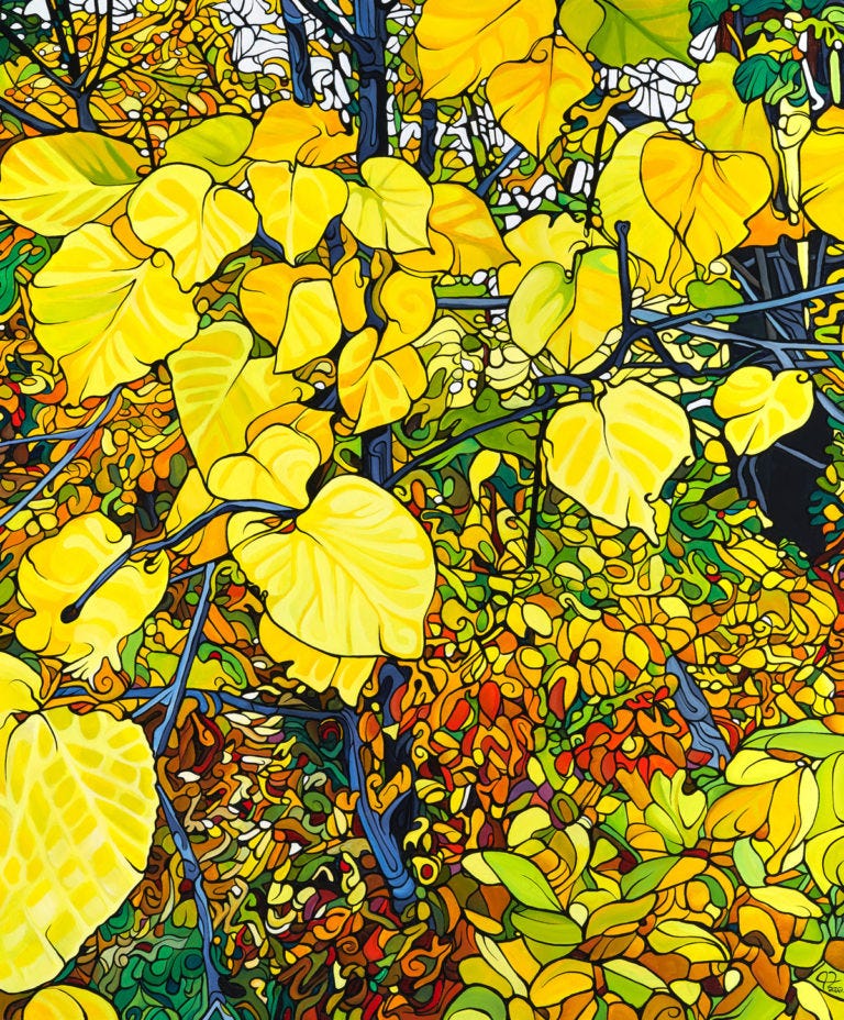
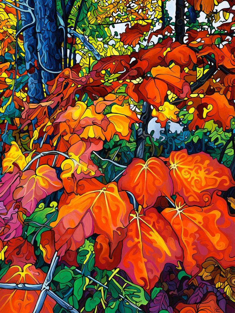
Orange & Brown
Orange and Brown has movement built into it. Even when it’s used softly, it tends to add a bit of energy to whatever sits near it, like a low hum in the room. It can feel generous, warm, and lively, and it often makes a space feel more social without trying. Orange changes character depending on the surrounding palette. Beside blues it can feel electric. Beside earth tones it can feel natural and grounded. In the right setting, orange doesn’t just brighten a room, it animates it.

Red
Red carries the most immediate presence. It doesn’t usually wait for you to notice it. It enters the room and claims a certain amount of attention, even when it appears in small passages. Red can energize a space, sharpen focus, and create a sense of intensity, which can be exactly what some rooms need. But it can also raise the overall volume of a room if there’s already a lot going on. Red is a colour that benefits from placement and intention. Where it sits on the wall, what it’s paired with, and what kind of light is on it can change everything.

Teal
Teal sits between blue and green and tends to hold a room steady rather than calm or energize it. It carries a sense of balance, offering depth without heaviness and colour without urgency. Teal responds noticeably to light, feeling fresher in daylight and more contained under warmer evening light. It doesn’t dominate a space, but it rarely disappears, making it well suited to rooms where you want presence without pressure.

Pink
Pink is often misunderstood because people treat it as one thing. In practice it has range. Some pinks feel airy and gentle, almost like a softened light. Others feel bold and modern, and they can push a room in a more playful direction. Pink tends to react strongly to lighting. In warm light it can feel cozy, even quiet. In cool light it can become sharper and more graphic. It also changes depending on how much space you give it. A small amount can feel like a lift. A large field can become the atmosphere of the room.
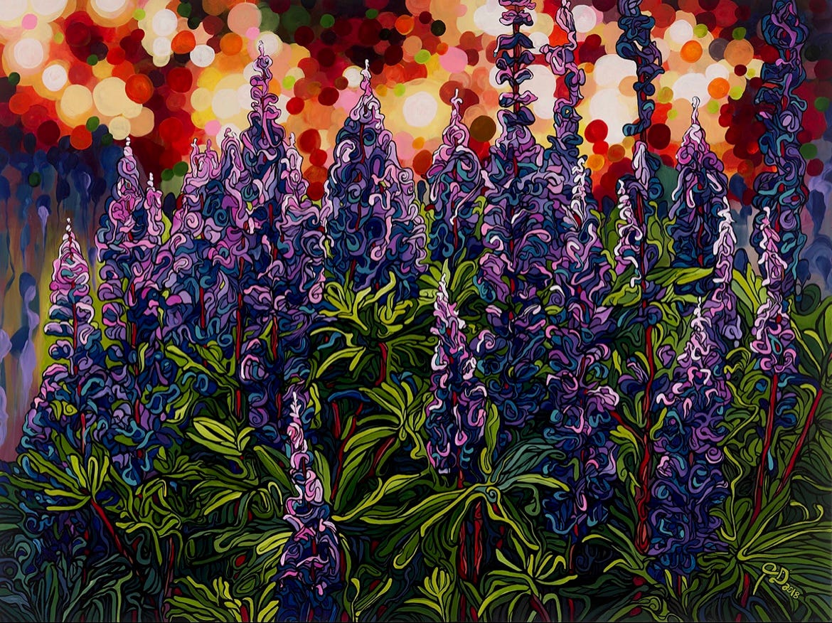
Purple
Purple often reads as depth. It can feel contemplative without being heavy, and it can hold a room in a way that doesn’t depend on brightness. Purple tends to shift across the day. In natural light it may open up and feel more spacious. In dimmer light it can gather itself and become more intense. It also has a way of carrying mystery without needing symbols or drama, simply by the way it sits between warm and cool. In a room that feels too plain, purple can introduce complexity without chaos.

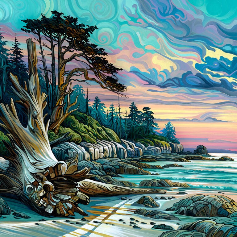
Multicoloured
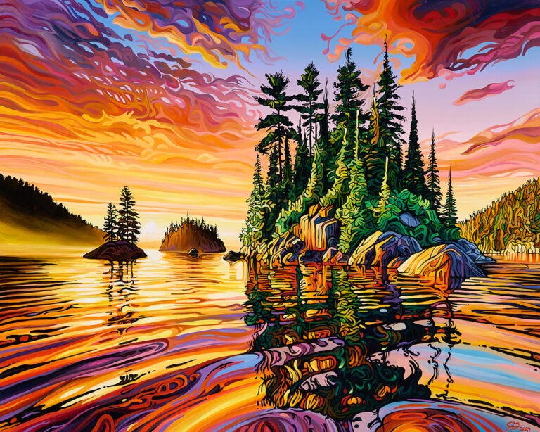
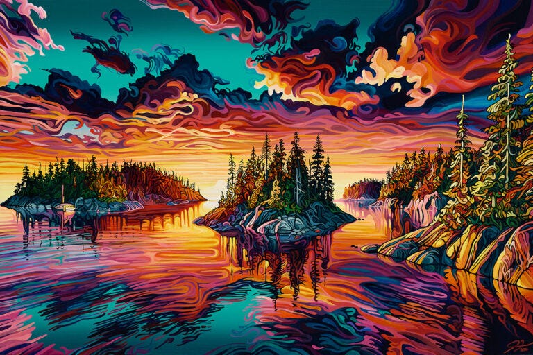
Multicoloured work behaves differently than single-colour dominance. Instead of steering mood in one direction, it creates movement. Your eye travels. The room stays awake, but not necessarily louder. A multicoloured painting can act like a kind of weather system on the wall, shifting depending on where you’re standing and what kind of light is in the space. It also tends to become a point of return. You notice different passages on different days, and the painting keeps giving you new places to look.

#228 – Danced to the Lake Below
Colour isn’t the only thing at work, though. Shape matters. A painting built around softer, rounded forms often reads calmer than one built on sharp angles, even if the palette is similar. Subject can matter too, not as a message, but as an atmosphere. A quiet landscape gives the eye somewhere to rest. A storm scene keeps the eye moving. Colour works alongside these elements, not above them.
The longer you live with a painting, the more you notice that colour is not a switch. It’s a presence. It changes with light, with season, with what else is in the room, and with your own attention. And it does most of its work without asking to be analysed.
Thank you for reading.
~Jeff