
By Jeff Dillon | May 6, 2022 | All Posts
It’s no secret that colour can have a big impact on our mood. Just think about how you feel when you see a beautiful sunset, or how a room feels when it’s painted in a calming blue hue.
But what you might not know is that the colours we’re exposed to can have a big impact on our mood and emotions. Studies have shown that certain colours can influence our energy levels, our ability to focus, and even our level of stress.
So if you’re looking to boost your mood, it’s worth considering the colours in your home or office environment. Here’s a look at how different colours can influence your mood, and some tips on how to use colour to your advantage.
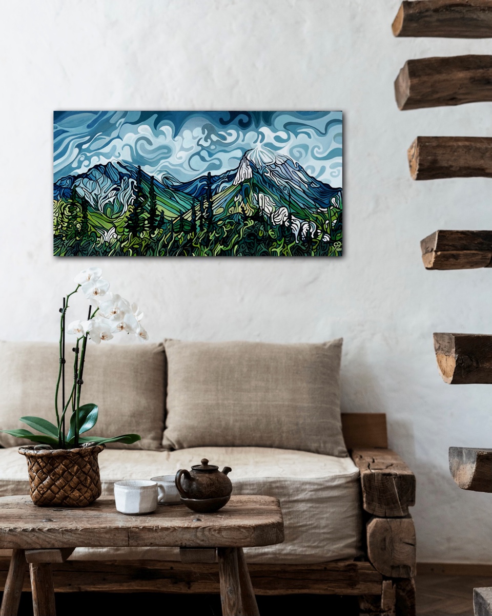
Blue
Blue is often associated with feelings of calm and relaxation. This colour has been shown to lower our heart rate and blood pressure, and it’s even been linked to improved sleep. Adding a painting primarily blue will create a serene and tranquil ambiance. If you’re looking to create a more calming environment, blue is a great choice.
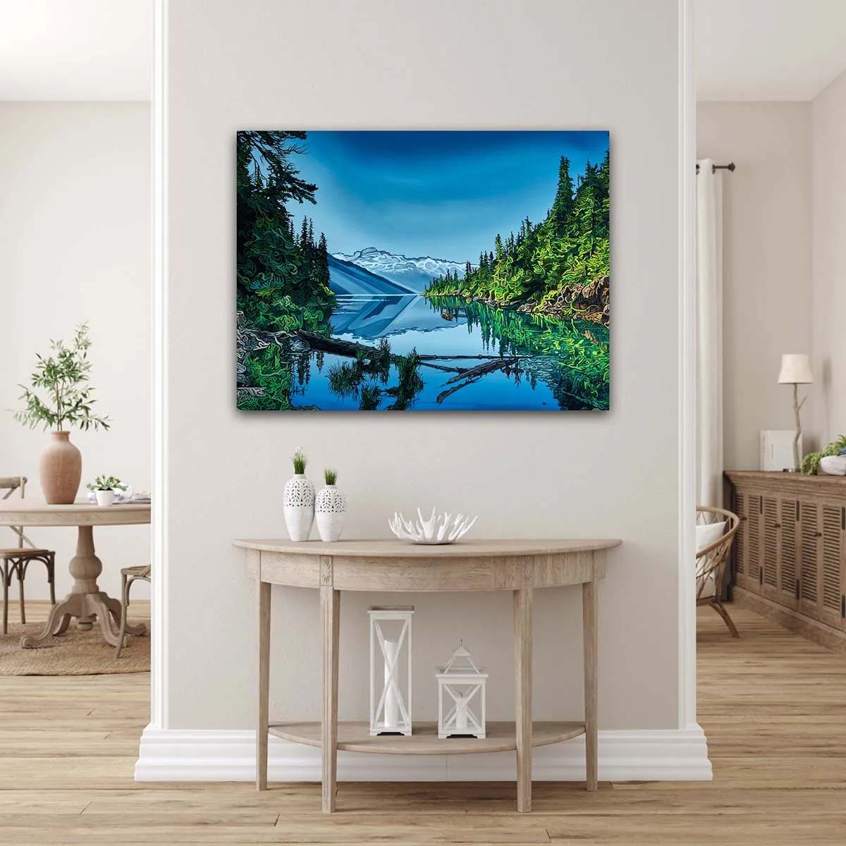
Original Work By Jeff Dillon
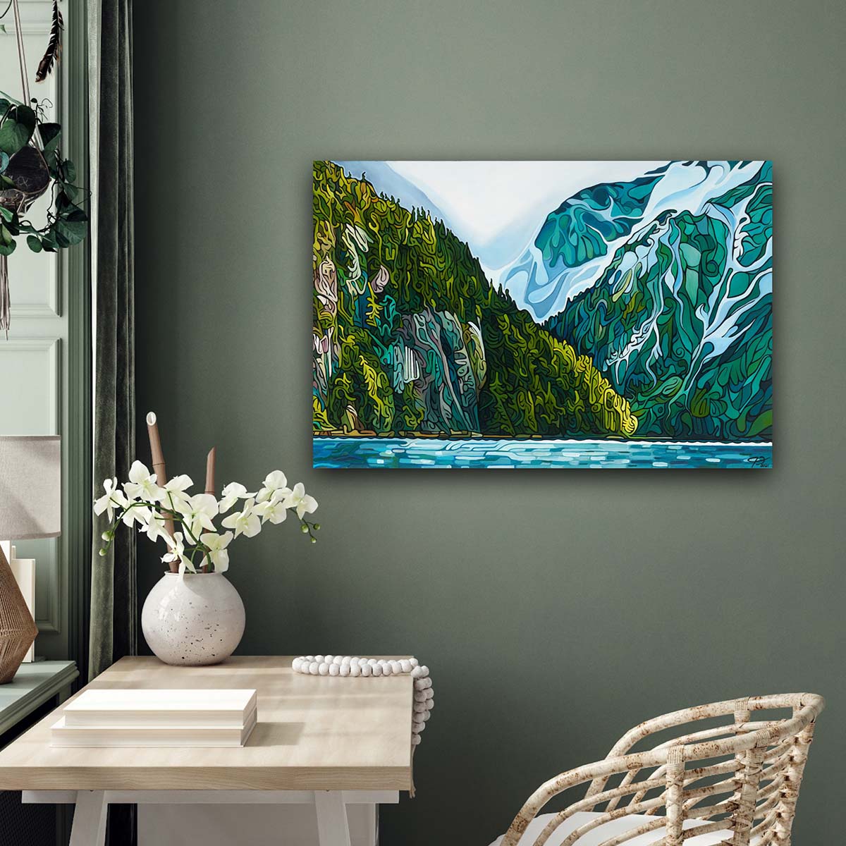
Green
Green is another colour that can be associated with calm and relaxation. This colour has been shown to reduce stress, and it’s also been linked to increased creativity. Our primal connection to nature makes green an important colour. In fact, the human eye sees green better than any color in the spectrum. If you need a little boost of inspiration, consider adding some green to your environment.
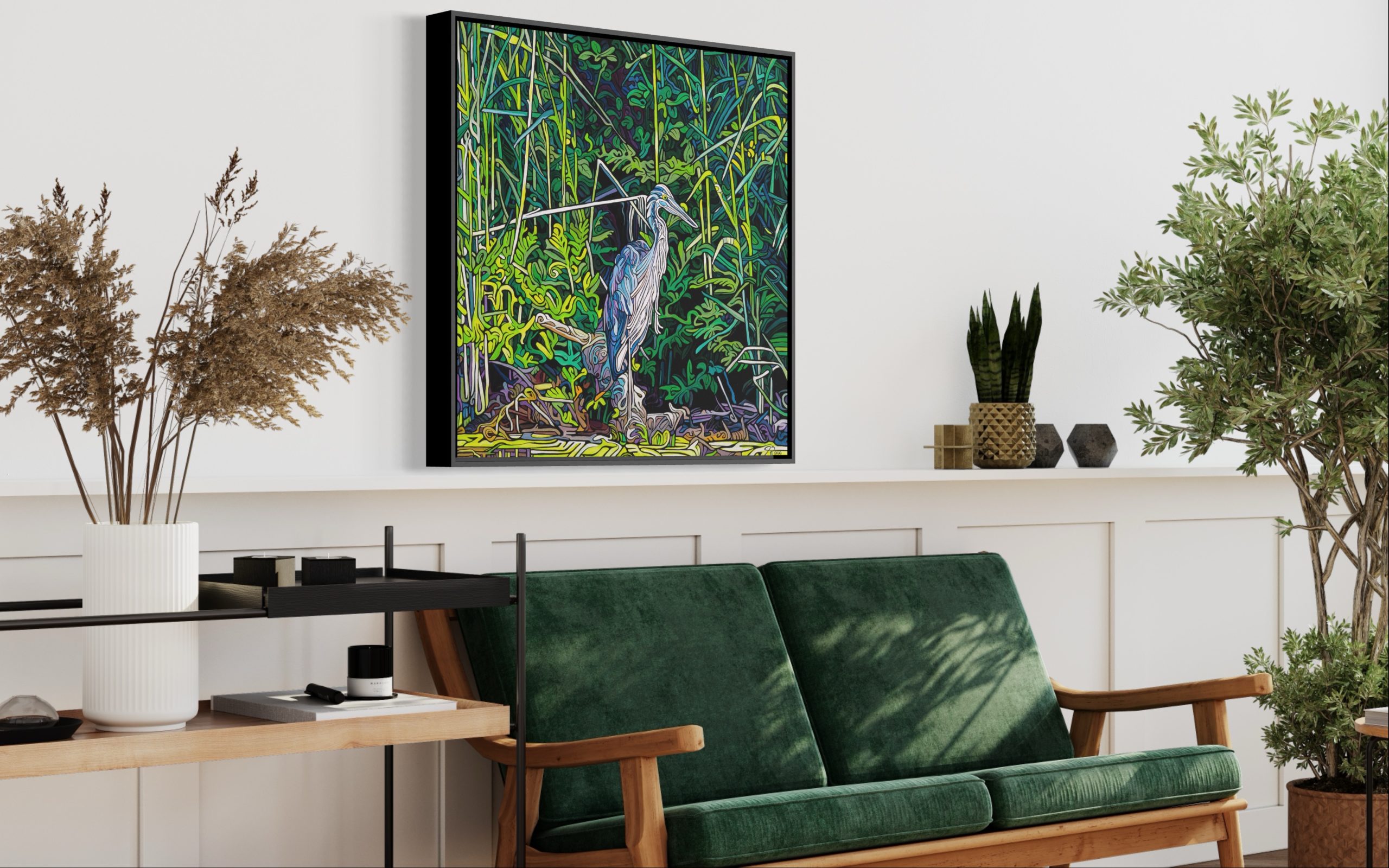
Original Work By Jeff Dillon
Yellow
Yellow is often associated with happiness and positive emotions. This colour has been shown to increase our levels of serotonin, which is a chemical that helps to regulate our mood. Yellow is also known to improve our focus and concentration.
So if you’re looking to add a little sunshine to your life, consider incorporating yellow into your environment. Just be careful not to overdo it – too much yellow can actually have the opposite effect and make us feel anxious.

Original Work By Jeff Dillon
Orange
Orange is often associated with energy and enthusiasm. This colour has been shown to increase our heart rate and blood pressure, and it can also help to improve our mood. If you’re looking for a little pick-me-up, consider adding some orange to your environment.
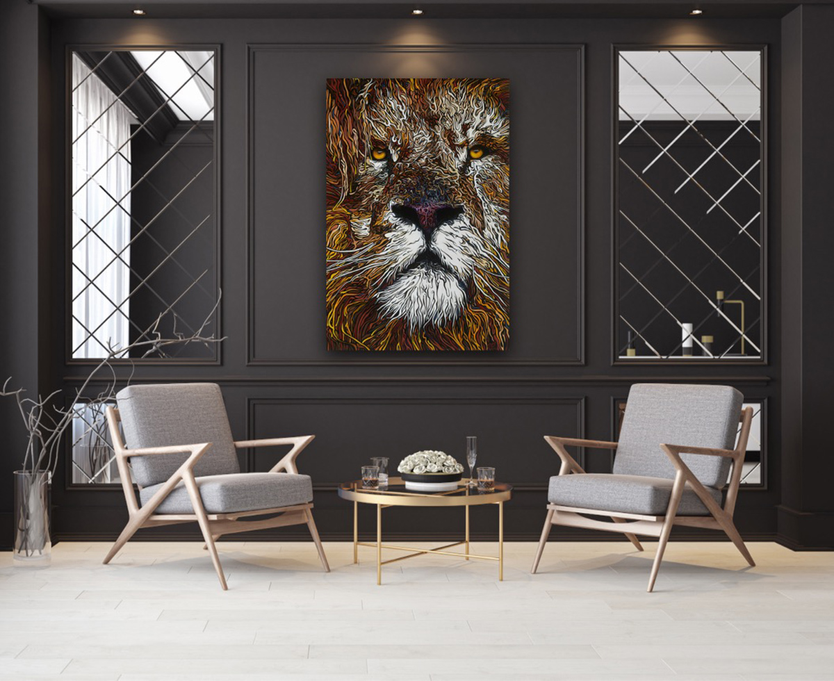
Original Work By Jeff Dillon
Red
Red is often associated with energy, excitement, and passion. It’s no surprise, then, that this colour can have a big impact on our mood. Studies have shown that red can increase our heart rate and make us feel more alert. It’s also been shown to increase our level of stress.
So if you’re looking to boost your energy levels or get your adrenaline pumping, red is a good colour to consider. But if you’re feeling overwhelmed or stressed, you might want to steer clear of this hue.
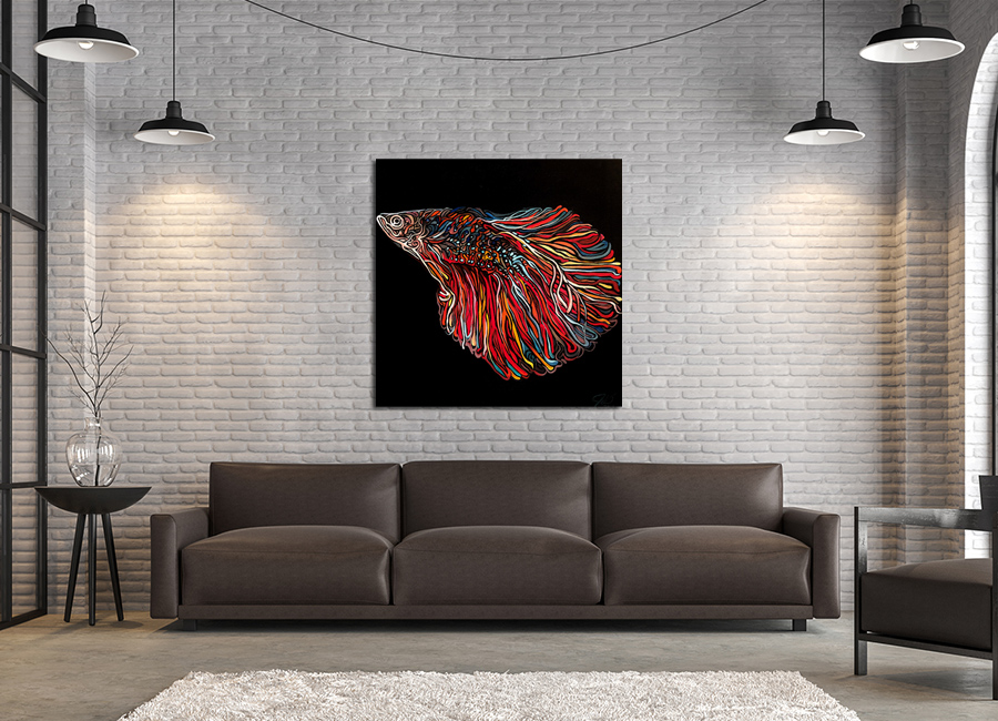
Original Work By Jeff Dillon
Purple & Pink
Purple and pink is often associated with royalty, luxury, and mystery. This colour has been linked to increased creativity and imagination, and it can also help to reduce stress. If you’re looking to add a touch of luxury to your environment, purple is a great choice.
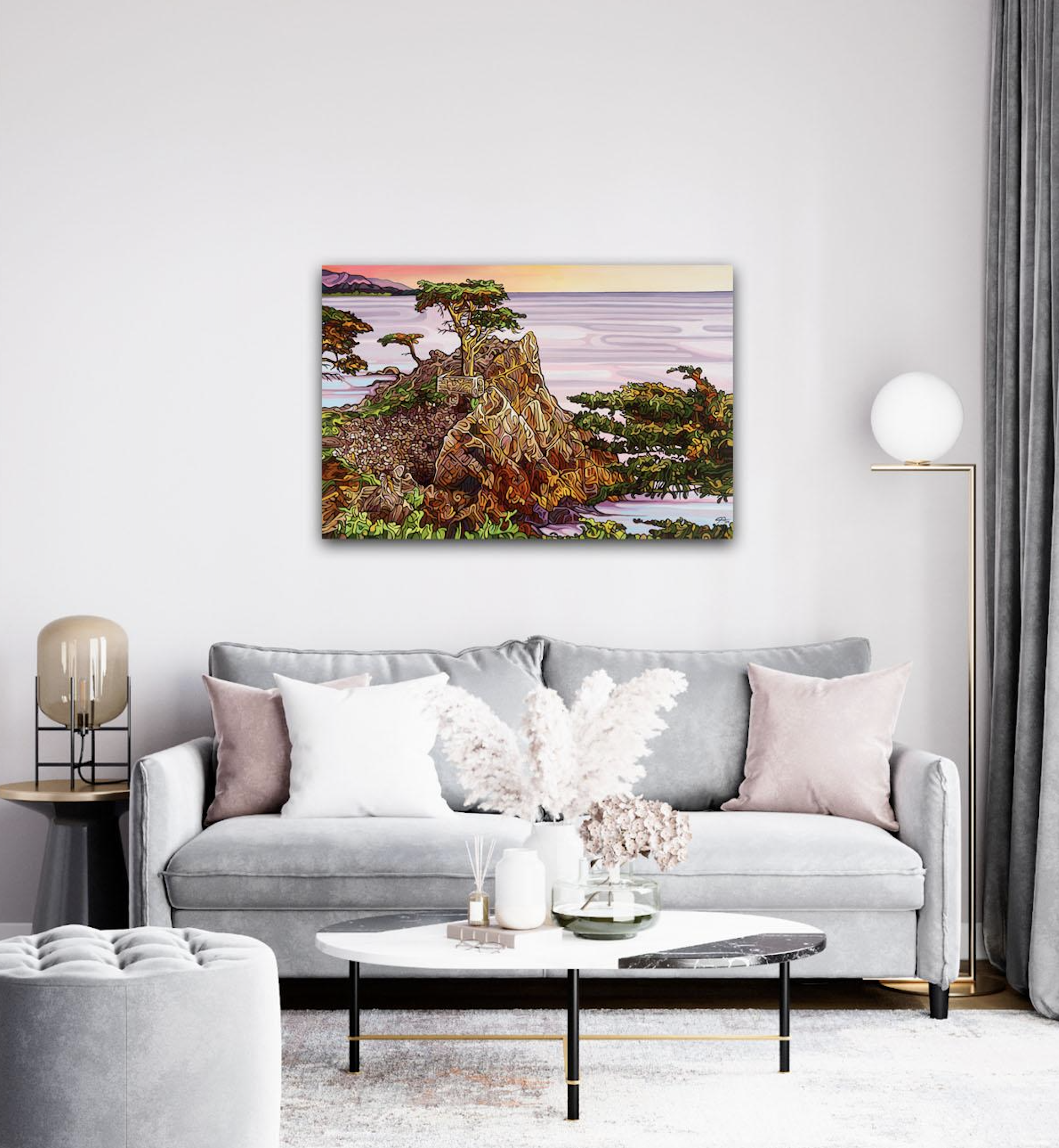
Original Work By Jeff Dillon
All Colours
If you’re having trouble deciding on a painting colour scheme, why not go for a painting with all colours? A fine art painting with a colourful palette can add a touch of energy and vibrancy to any room. Plus, it can be a great conversation starter – everyone will want to know where you got such a beautiful piece! Neo matter what painting you choose, make sure to choose a piece that you love.
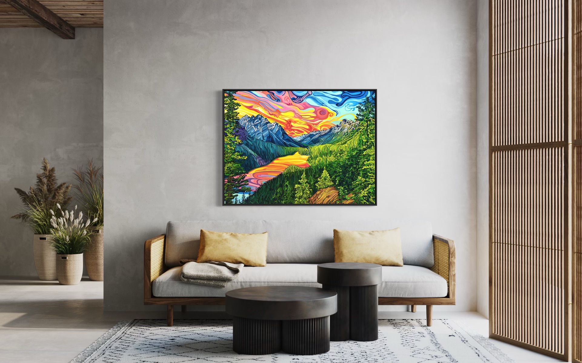
Original Work By Jeff Dillon
When it comes to art, colour is one of the most important tools that artists use to express themselves. But colour isn’t the only thing that artists use to communicate emotion and elevate the viewer. Shape and subject matter are also important elements that can influence the mood and overall feel of a piece of art.
For example, a painting that is primarily composed of soft, round shapes is likely to feel more calming than a painting that has sharp, angular shapes. And a painting that depicts a idyllic landscape is likely to evoke feelings of peace and serenity, whereas a painting that shows a raging storm might elicit feelings of fear or anxiety.
Original Work By Jeff Dillon
So, the next time you’re looking at a piece of art, take a moment to consider the colours, shapes, and subjects that the artist has used. These elements can give you insight into the artist’s feelings and intentions, and they can also have a big impact on your own mood.
Original Work By Jeff Dillon
If you are interested in purchasing a fine art painting or a limited edition collector print, please contact me for more information. I would be happy to help you choose the right piece of art for your home or office. I am an experienced artist and have a wide selection of both original paintings and limited edition prints. I am confident that I can find the perfect piece of art for you, and I am always available to answer any questions you may have. Please don’t hesitate to contact me if you are interested in purchasing a fine art painting or collector print. I look forward to hearing from you.
Jeff Dillon